Visualization of Newspaper Presidential Endorsements
Click for full screen visualisation – Note: the filters are a work in progress!
Data and Questions
In my visualization, I set out to explore whether the newspaper endorsements had an impact on state voting results and on national results. The dataset which my visualization uses is a dataset for 100 newspapers in the United States and which candidates they have endorsed in presidential elections since 1980.
Furthermore, I combined this data with data of voting outcomes in all the states for the US elections since 1980. I wanted to be able to show patterns of where the newspapers were located in each year who endorsed the winning candidates. Furthermore, I incorporated the state voting information because I decided that would give information on whether the newspapers aligned with the voting in the states they were located in.
Ideation Process
For my design method, I used the 5-design sheet method. I came up with general ideas such as bar charts, scatterplots, a table and a map. I liked the idea of a table as I thought it would be a simple way of representing the data and provide a good overview, although I felt that I wanted to do something more challenging.
I, therefore, decided to implement a map as I was interested in how I could combine the supplied data set with other data to see how the location of newspapers correlates with their endorsements. However, I decided I wanted to incorporate geographic information also. I initially decided to plot the newspapers and the party of candidates they endorsed represented by different colored map markers. This was because I thought it would be interesting to see whether there were any patterns in the newspaper endorsements, as I knew that different locations in the states tend to have certain political alignments (e.g. Texas is Republican).
I then thought it would be good to incorporate the states voting data, and the States are represented as blue if they voted more Democratic and red if they voted more Republican. This made it easy to spot patterns of how the location of newspaper endorsements matched up to the voting results of each state. However, something I did not like with my visualization is that it was not easy enough to see patterns in which newspapers endorsed the winning candidates (overall and in the State of the newspaper). Therefore, I decided to incorporate filters for this.
Data Sources
The data with the states tiles was sourced online and modified using excel to create a geoJson and add in an id for each state for indexing purposes. The data for state voting was sourced online and edited in excel for easier manipulation with d3.js. This dataset has the vote share for each major candidate in each state for all the years from 1828-2016.
For combining data sources, predominantly excel was used for convenience. I also incorporated a slider, which was sourced online.
Description of the Visualisation Content
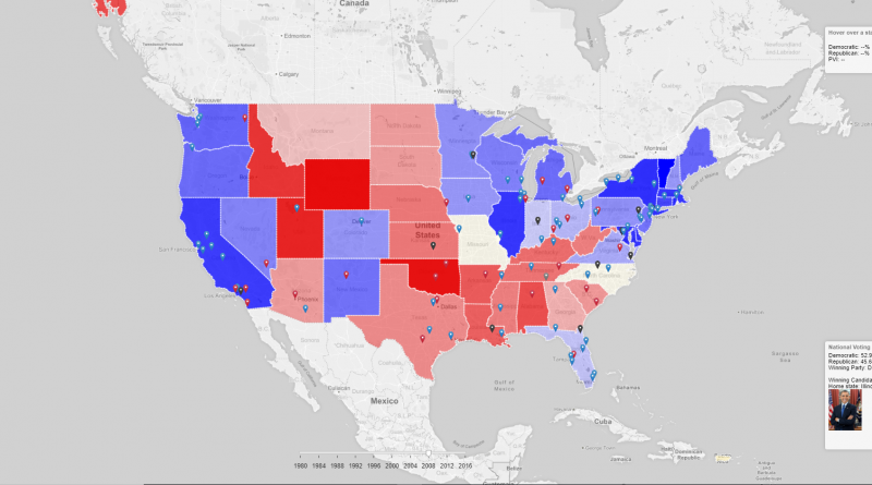
The map was created with Leaflet and D3.js. It can be seen below:
In my visualization, each state is colored depending on the voting data for that state. Red indicates a Republican majority and blue represents a Democratic majority. The opacity shows how great the majority was. There is a filter so that you can change whether the color is determined based on PVI or the percentage majority of the most popular party in that state. If PVI is selected, it uses the Cook Partisan Voting Index, to measure how strongly the state leans towards the Democratic or Republican Party, compared to the nation for that year. This means, for example, a state could have voted 52% democrat and 47% Republican, but if the national vote was 54% democrat and 45% Republican, then the state would be red (more republican then the nation as a whole). If percentage majority is selected, it calculates the difference in percentage votes for Democrat compared toRepublican for that state in the year. The opacity and color of the states are determined by this.
Markers
Markers represent newspaper endorsements, and they are placed on the headquarters of that newspaper. The markers are colored depending on who they endorsed.
I aimed to have a legend on the map showing this information, but unfortunately have not gotten around to it yet.
Interactive Features
When the mouse is moved over a marker, there is a popup with the name of the newspaper and their endorsement.
When the mouse hovers over a state, the state voting information is displayed in the top right corner. This is the PVI, percentage democrat and percentage of Republican votes.
The national voting information is displayed for the year selected below this, including a link to the Wikipedia page of the winning candidate along with a photo of the candidate.
Further Filters:
- Year Slider: there is a slider so the year can be adjusted and only the data from the selected year is shown.
- Show only endorsements for: this hides all endorsements that do not meet the criteria of the checkboxes. These criteria are only winning candidates and only losing candidates. Also, there are criteria for only candidates who won in the state of the newspaper (e.g. if a newspaper in Texas endorses a Republican candidate and Republicans won in Texas), and only those who lost in the state of the newspaper.
- Evaluate whether a candidate won a state based on: for the criteria to only show candidates who won/lost in the state of the newspaper, these are evaluated using either PVI or the percentage majority in the state. These filters are to select which one of these.
- Colour states based on: as in 3., for the color (and opacity) of the states, one can select whether to use PVI or percentage majority.
Other Visualisation Ideas:
I was intending to have the table on the right of the visualization and the map on the left. For the table, I thought it would be interesting if I had the same filters as the map, so only the rectangles that matched the filters would be visible. This would be good for getting an overview across years seeing which newspapers endorsed winning candidates, and losing candidates.
The intended layout was to have the map on the left and the table on the right.
Issues:
I found out that when I put them side by side, it was not easy to see either visualization. I experimented with having both in resizable iframes, however, they were both too small. Therefore, I decided this would not be feasible. Furthermore, due to time constraints, I was not able to develop the filters for the table. However, whilst this was disappointing, I thought it would be much better to get the map visualization working correctly as the table was like the example provided and I wanted to focus on doing something different.
Insights and Critical Discussion
My visualization was useful at showing whether the newspaper endorsements correlated to the voting results in the states they are located in.
Furthermore, it was possible to see in each year the states that voted for each candidate. Finally, it was possible to see whether there was much difference in these patterns when one used the PVI metric for the states, compared to just comparing the percentages in that state.
1996 Election
Something I found interesting in the data was looking at the 1996 election. I found that when the states were colored based on percentage, and only showing the endorsements in the States where Democrat had a greater vote percentage than the Republican, almost all the endorsements were in the North East, and the West coast, with a band of blue states down the center. Upon changing to PVI, the band extends, showing the possible swing states.
2012 Election
Furthermore, something I found interesting was looking at the 2012 election. There were a lot of black markers (representing endorsements for nobody) in the South, in red states (Republican), showing that many of the newspapers did not think the candidate opposing Obama (Romney) was a good candidate.
As before, I think it would have been interesting to have the table. Something I would have been interested to see would be to have a filter on the table to show only the endorsements that were different from the outcome of the state in which the newspaper was located. If newspapers are going against the public opinion in a state which traditionally leans to one political party, it suggests that the candidate does not have a good chance of winning.
Something else that could have improved the visualization would be to have a breakdown on the map, showing the total markers of each type (mainly Republican and Democrat). This would help show if there is a correlation between the number of endorsements and the chance of a candidate winning. However, looking at 2016, Trump only got two endorsements from the newspapers in the data. One of these was in Nevada (which voted Democrat) and the other was Florida which he won. Clinton, on the other hand, got lots of endorsements, even in traditionally Republican states that are colored red using either metric. This would indicate that if there is a correlation, 2016 was an anomaly.